CEDIMED Website
A UX driven case study of re-designing a website which showcases products to varying users.
- Role: Market Research, User Research, Requirement Analysis, Persona, User Flow, UI
- Client: Personal Project
- Duration: Oct ’19 – Dec ‘19
Status, Role & Contribution
There was already a working design pitch in place and the client wants to get a second perspective on it.
And so, I took it as a case study to incorporate some of my recent studies and realizations of an appropriate design approach with proper methodology.
The complete article can be found over at Medium
The short version can be found over at Behance
Challenge
To create a clean, minimal, familiar & modern website that tackles the different pain-points of targeted end-users by a UX driven approach.
Project Intro
CEDIMED is a starting medicine manufacturing and distributing company. It has a range of products suiting from pain management to E.N.T and more. The client needs a website which can showcase their products in a way which can convert users and generate revenue.
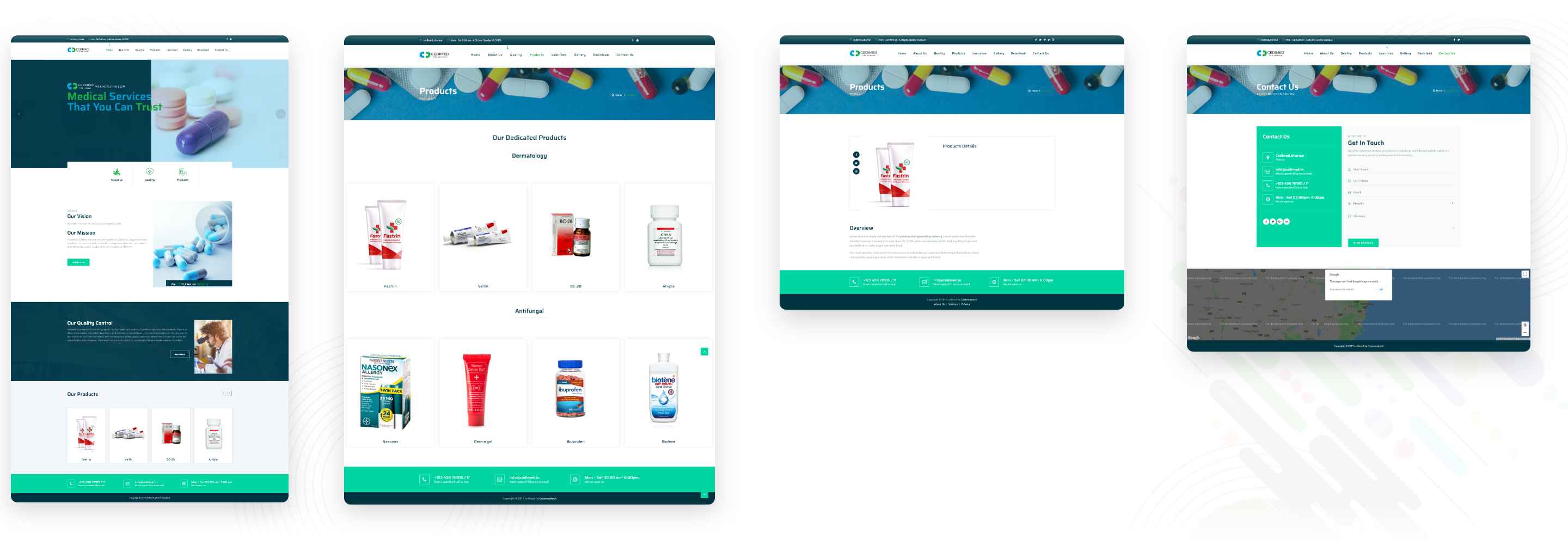
Following is a few snaps of the old website -
Work
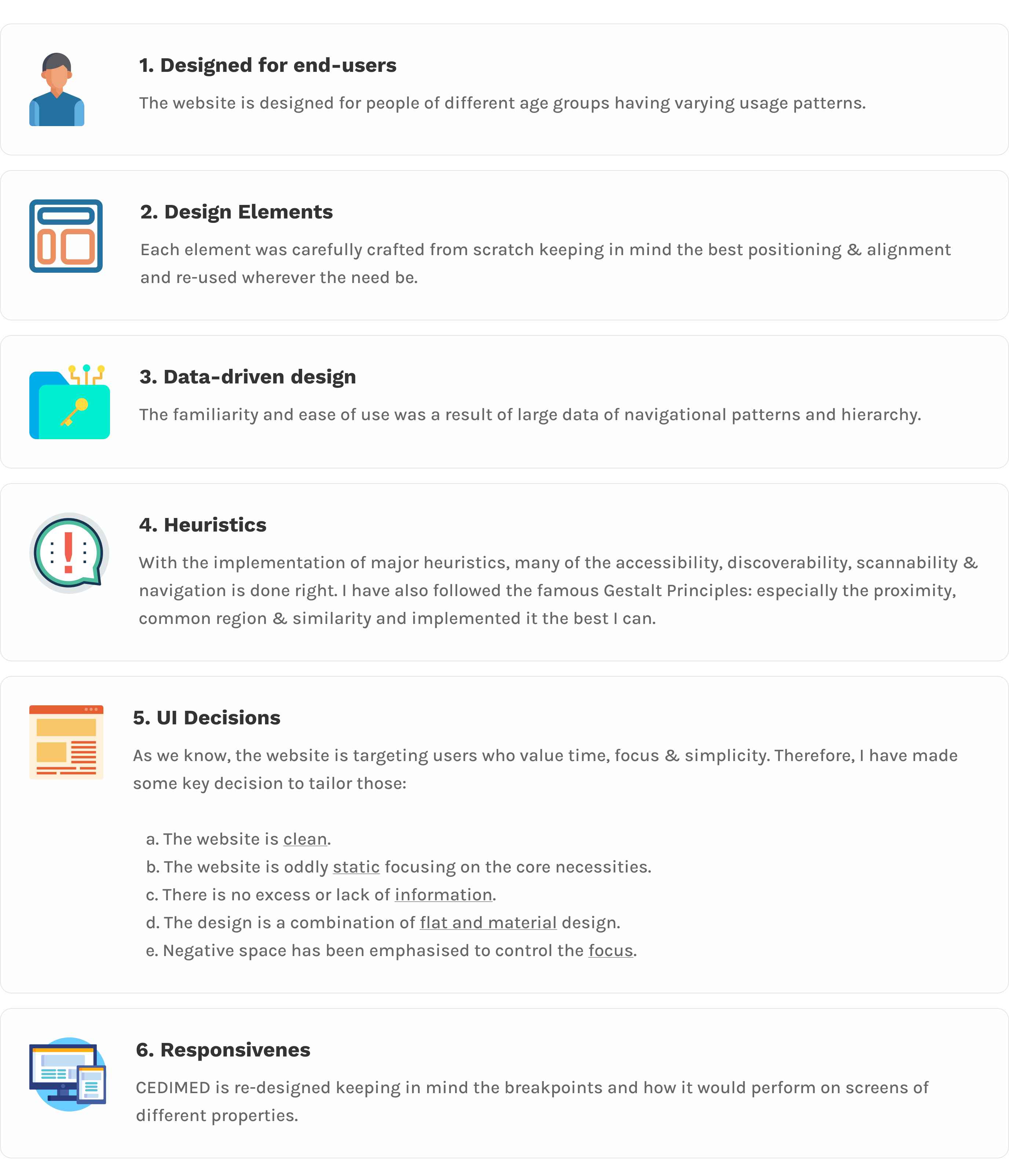
The website contains only the core pages needed to pitch in the overall design, but enough to have a full understanding of it. Since this is a re-design and not a build from scratch, I’ve tried to implement as much of UX Methodology as I can.
I. Interviews
I was able to have multiple discussions with the client which allowed me to have a deeper understanding of the requirements.
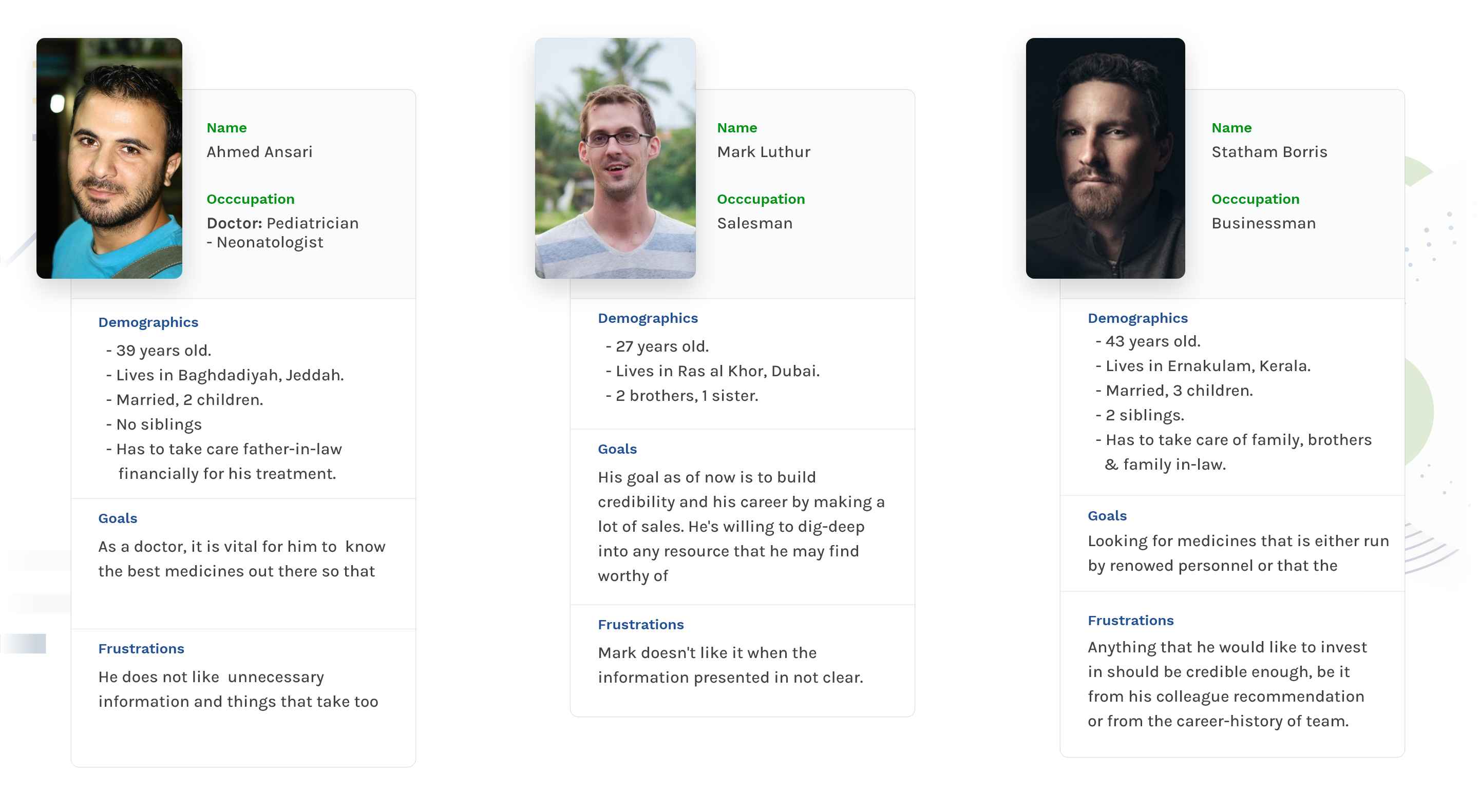
II. Personas
There are three main types of users we’re targeting: Doctors, Salesmen & Company Owners looking to invest.
III. Content Hierarchy
All the content is placed in such a way that naturally scrolling through them once is enough to understand the purpose and the scope of the site.
IV. Typography
Vesterbro & SF Pro Display are the two fonts I have chosen. It is a combination of Sans & Sans-serif based fonts. And this is helpful for many reasons.
- It’s a widely adopted pattern.
- It is easily distinguishable.
- The line-height is such that it does not stress the eyes or your cognitive load.
The size, line-height, character limit and content have also been meticulously considered. They also pass the WCAG test too.
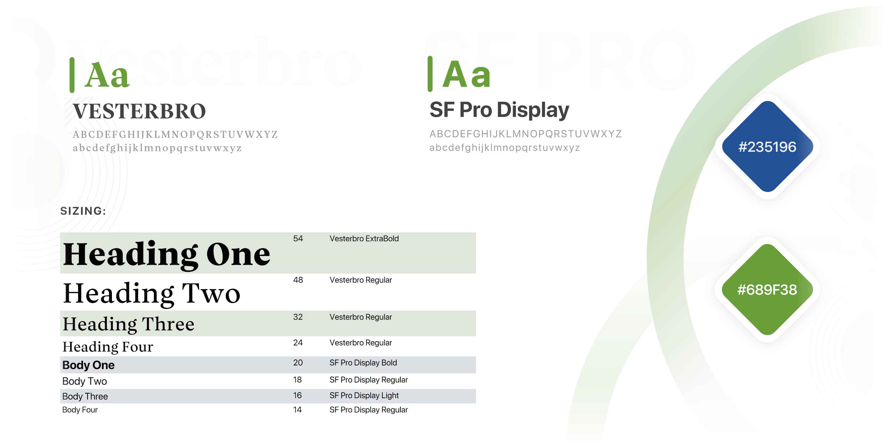
V. Colors
Colors help to tune stress and set the mood of viewers. It plays an important role in any design. The colors which are used calms the user and bring a sense of peace so that they may make a sound and solid decision.
The colors are consistent, brand-aligned and follows the accessibility standards. The placement of elements with colors are placed in such a way that it reacts to the visceral level, thereby passing the squint test.
VI. Design Language
User Interface (UI)
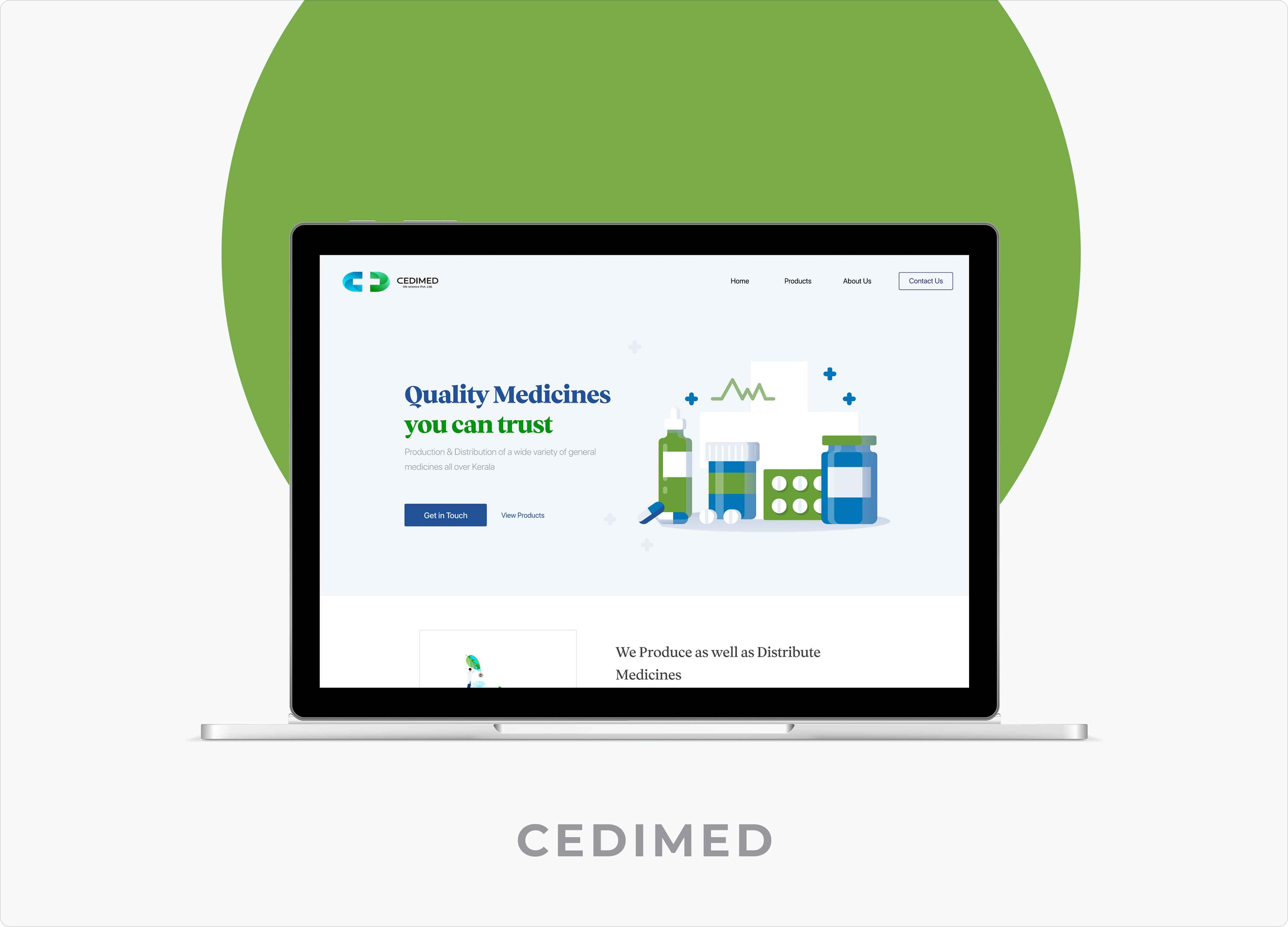
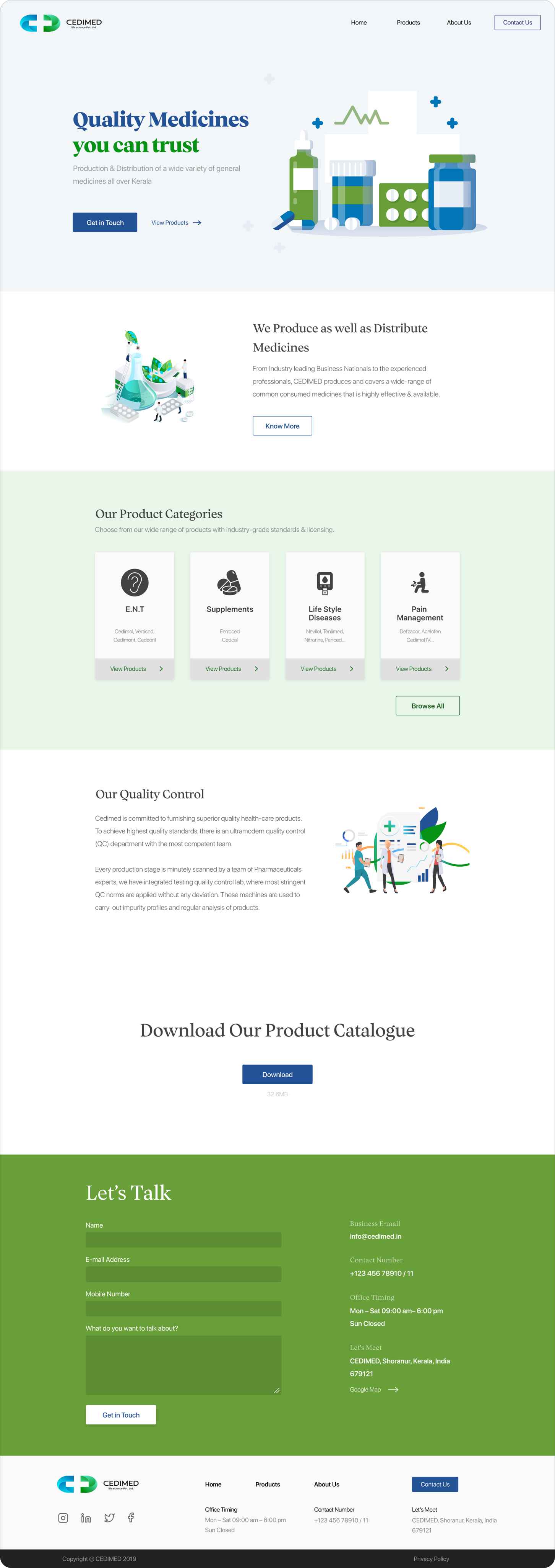
I. HomePage
The landing screen tackles a major point, which is to have the overall vision and goal of the site shown in a clean and understandable manner. The Products Category also clears many of the pain-points which you can see from the user personas.
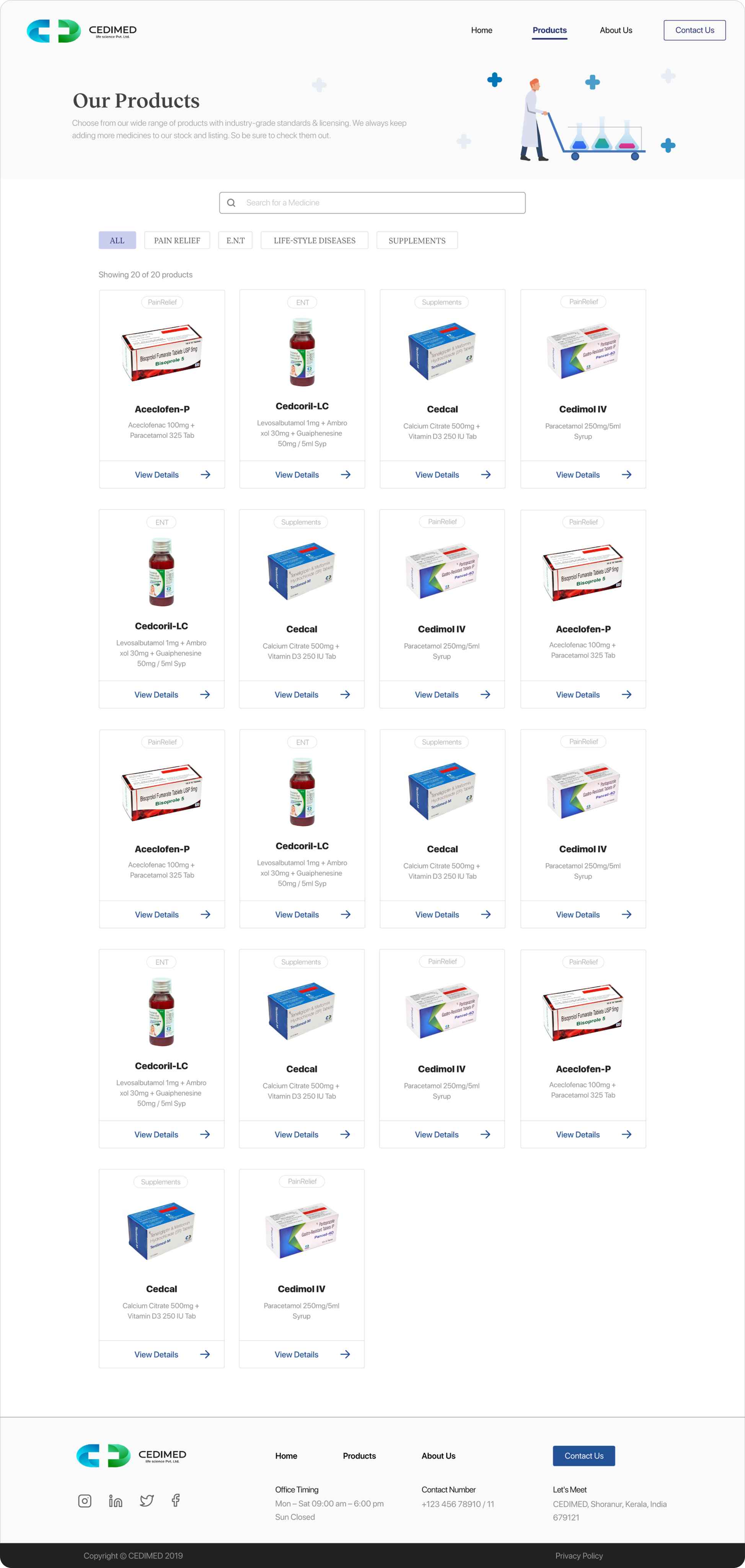
II. All Products
The user is given full control of navigation by having a search bar, categories, and with each product card. The information on the card is also placed in such a way that the user’s eye-tracking is constant & fluent.
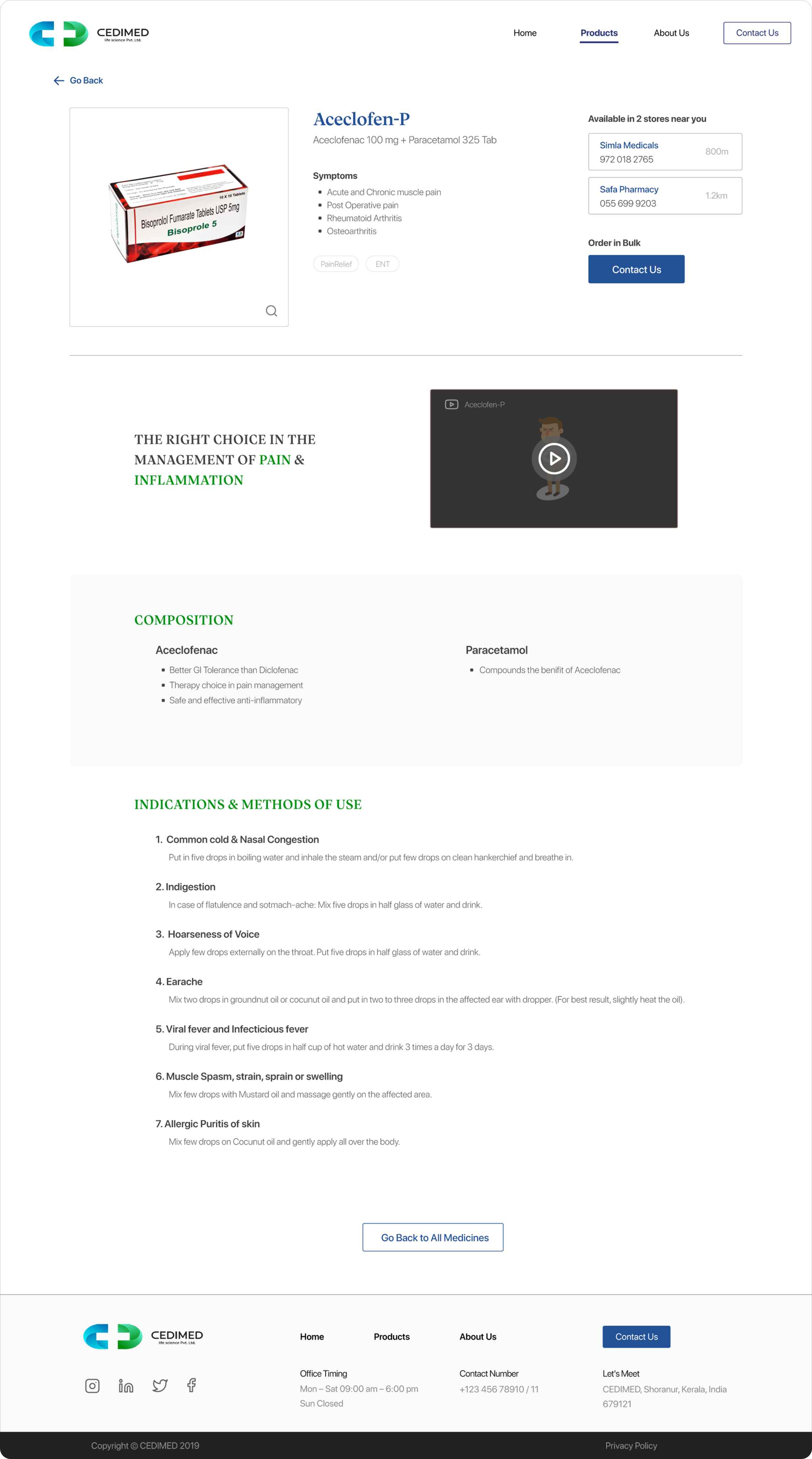
III. Product Detail
You’ll notice that this page follows a similar pattern that typical e-commerce sites do. This helps the user to navigate and accomplish his goal faster. It also contains relevant information for users of all types.
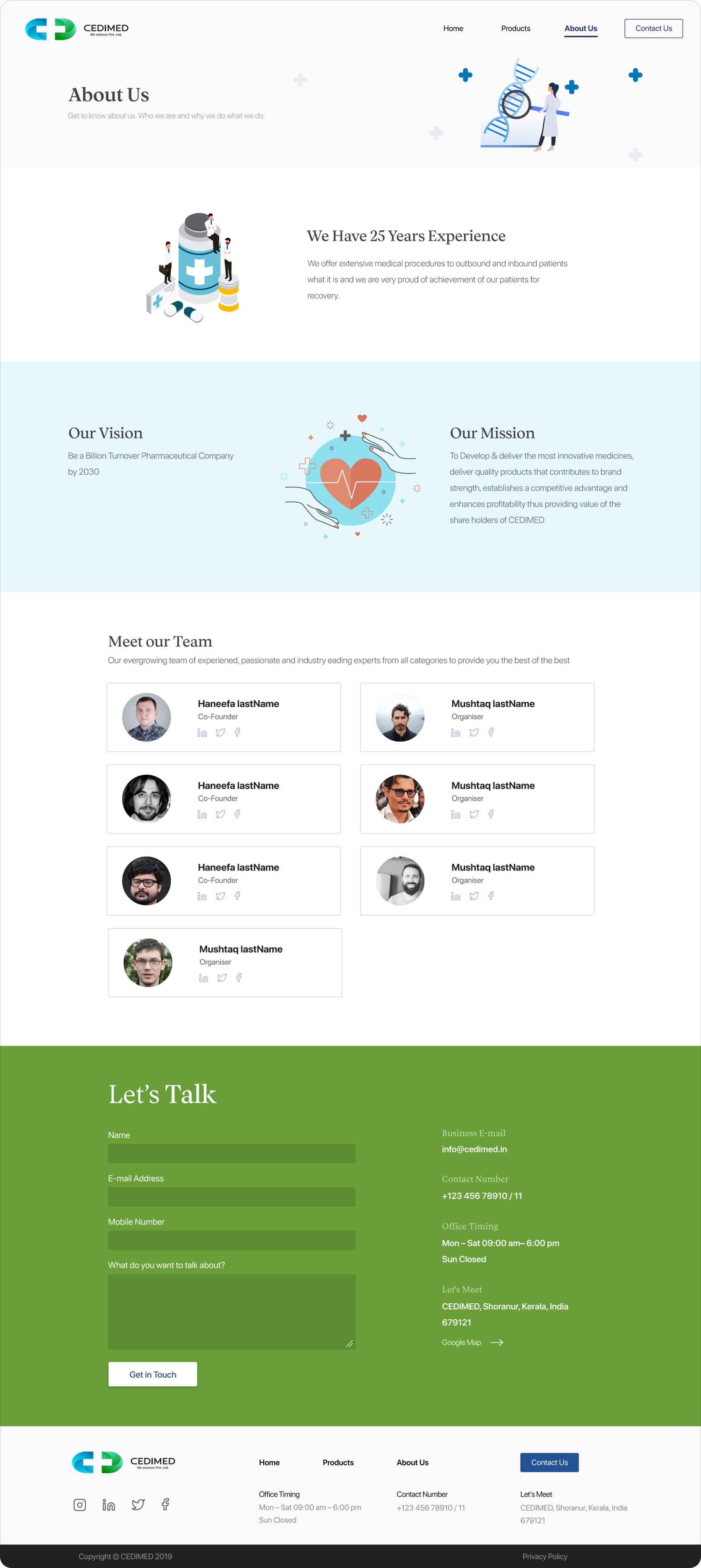
IV. About Us
This page also follows the header-footer pattern, the same as the others. The content displayed here is for credibility, trust & assurance purposes.
Result
The purpose of this project was to personally test out many ideas and knowledge that I’ve acquired from many articles and people in the past three months. The client approved of this design after presenting to them with all the abovementioned points.
The complete article can be found over at Medium
The short version can be found over at Behance