Voucher App Redesign
A 6-hour redesign of a voucher app which allows a user to purchase items off marketplace by redeeming points shared by the company.
- Role: Requirement Analysis, Market & Competitor Research, UI
- Client: Personal Project
- Duration: 6 hours – Aug ‘19

Status, Role & Contribution
Challenge
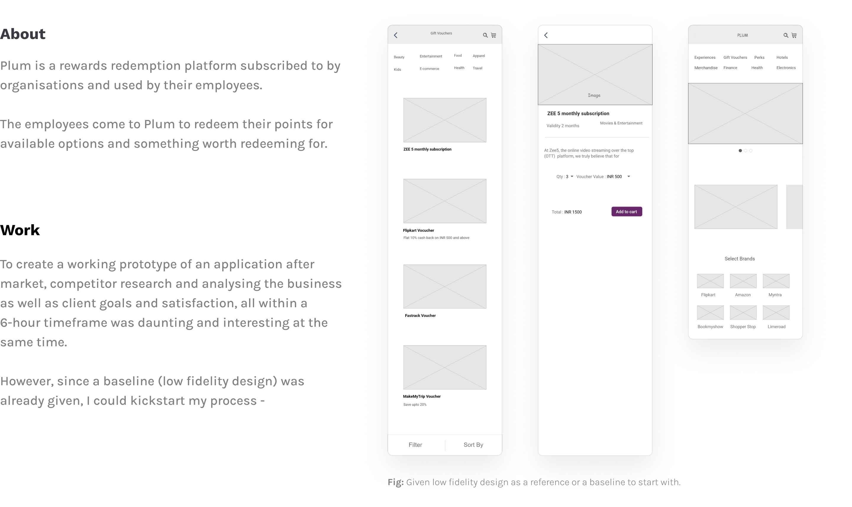
To re-design an existing voucher application that allows the users to seamlessly browse and redeem vouchers based on their interests.
Project Intro

Design Decisions
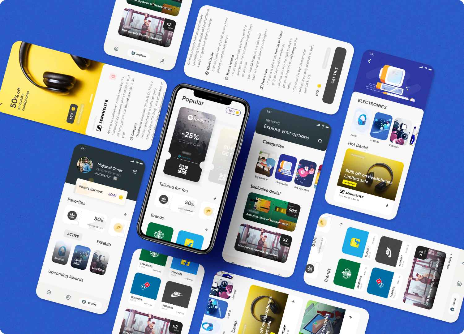
This app focuses on quality rather than quantity. Instead of having numerous vouchers which are irrelevant to the user, showing personalised vouchers based on the user’s interests and past e-commerce purchases, we can tailor quality vouchers to the user on time. It’s a win-win situation.
UX Decisions
Showing all categories at homepage and subsequent pages posed a number of issues -
- There is no incentive for the user to scroll down and explore the app
- Most of the times, there are no vouchers available in the respective category.
- Showing too much information at once can be stressful for the user
I have limited the tabs to 3 in the bottom navigation bar: Homepage, Explore & Profile. And this helps increase the user experience in a number of ways. Those are -
1. HomePage
You’ll see a very clean and modern, but all the required information presented in a clean and organised manner. Personalized vouchers can be shown based on purchase and browsing history.
2. Explore
A clean and modern showcasing of all the vouchers, in a categorised manner. Clicking on each will take you to the Details page. And clicking on each category will take you to the respective category page.
3. Profile
The profile shows the user details like the Name, company and the UserID given out by the company for redeeming points. It also shows the favourited vouchers & the active/expired ones as well.
UI Decisions
As a cross-platform developer, I know my way around what is implementable and what is a gimmick. All the pages, cards, categories are easily code-able.
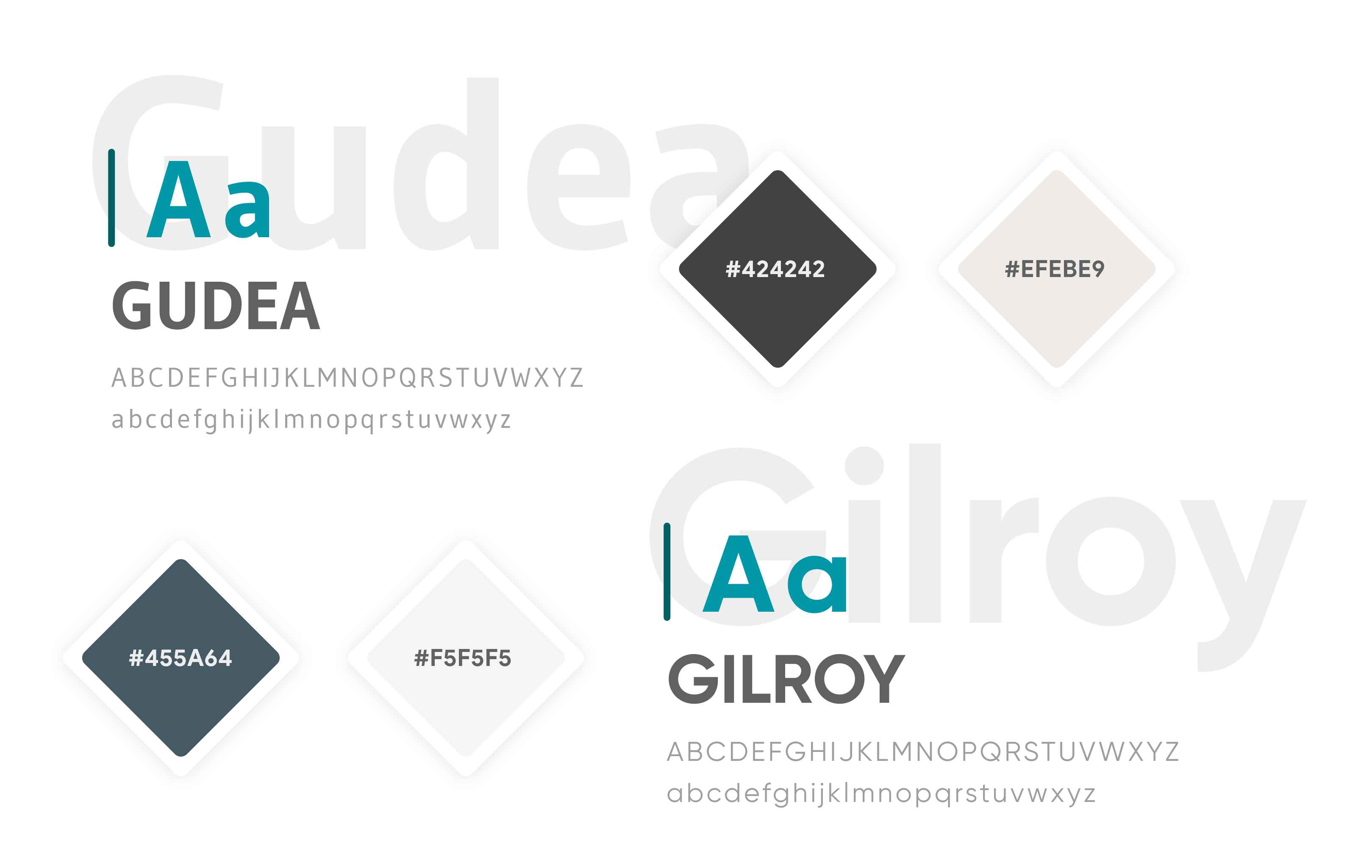
The UI is inspired from the latest UI updates from Google to its service apps like PlayStore, Drive, etc. I have been a long-time fan or CRED, HeadSpace, Tide, Reflectly, etc, apps which brings about a positive change in the way a user experience it.

User Interface (UI)

Result
Analysing, studying and trying out different ideas, all in a span of 6 hours – and to get a result that not only looks good, but is able to satisfy the user’s needs is definitely something that I am proud of.
The complete article can be found over at Medium
The short version can be found over at Behance